In the business world, no matter the industry we found ourselves, we always have targets and goals that we want to archive. In order to know the progress of our work, we tend to find effective ways to represent our progress or performance against the set target, and one of such ways or methods of representing performance against the target is the use of a bullet chart. A Bullet chart is variation of bar chart, used for making comparisons such as showing performance metrics against a target. Using bullet chart we can effectively represent our performance against the target to know whether we are progressing or not.
How do you read a bullet chart?
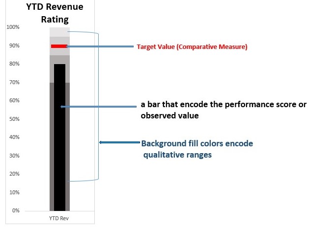
A bullet chart usually encodes three different data elements:
- An observed value known as Feature or performance Measure (performance score or the bullet). This is the primary data and is usually encoded as a bar, like the bar on a bar chart (encoded as black bar in the chart below) and centered in the plot area.
- A target value known as Comparative Measure used as a target marker to compare against the Feature Measure value. This is shown in the chart below as a short red line marker that runs perpendicular to the orientation of the chart. Whenever the Feature Measure hit or intersect the target, you know you’ve hit your target.
- A qualitative Range of values used for grading. These ranges do not only communicate the qualitative state of the featured measure but also the degree to which it resides within that state. If for instance the feature measure extends into a range that represents good, the distance that it travels into this range indicates how good it is.
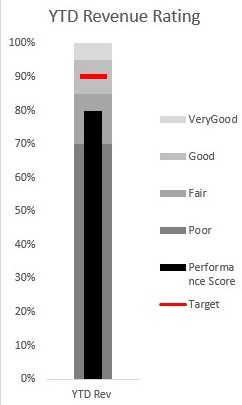
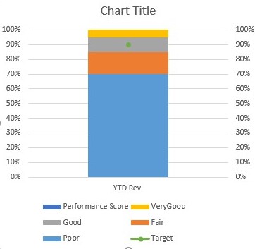
For example in the chart below, we are measuring the year to date (YTD) revenue rating for the year. Using this chart, we can see that the YTD rating is 80% (shown as a black bar) and this could not hit the target value 90% which is represented as a red line perpendicular to the black bar. With this bullet chart we can easily that although our performance came close the target value, we could not archive our set goal or target which is 90%.
Steps in creating a Bullet Chart in Excel
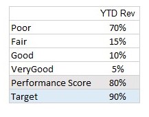
Using the table below we have three different data elements namely
- First four values which are the qualitative range of values used for grading.
- Performance score (feature measure) which is the revenue rating for the year.
- Target value which is the target that we wanted to archive for the year.
to create a bullet chart with this data
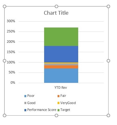
- Select the needed data (in our case the entire table). After selecting the data click on the insert tab and select recommended Charts then ALL Charts. From all Charts select Column chart and then a stacked column chart as below
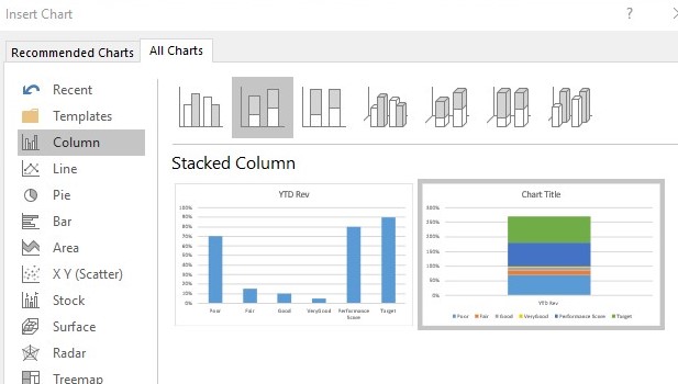
and click on ok to get the chart below
2. The range of values on the y-axis is from 0% to 300%. Let change it to have values from 0% to 100% by clicking on the stacked column chart then from Series Options under Format Data Series select vertical (Axis) value . After selecting vertical (Axis) value, now select Axis Options and click on the Axis Options to change the maximum value from 3.0 as shown below
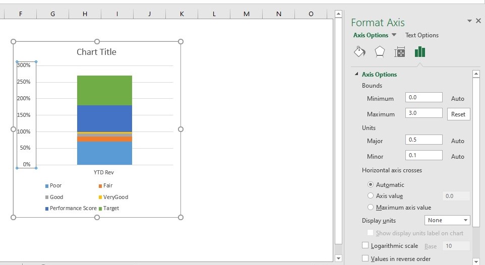
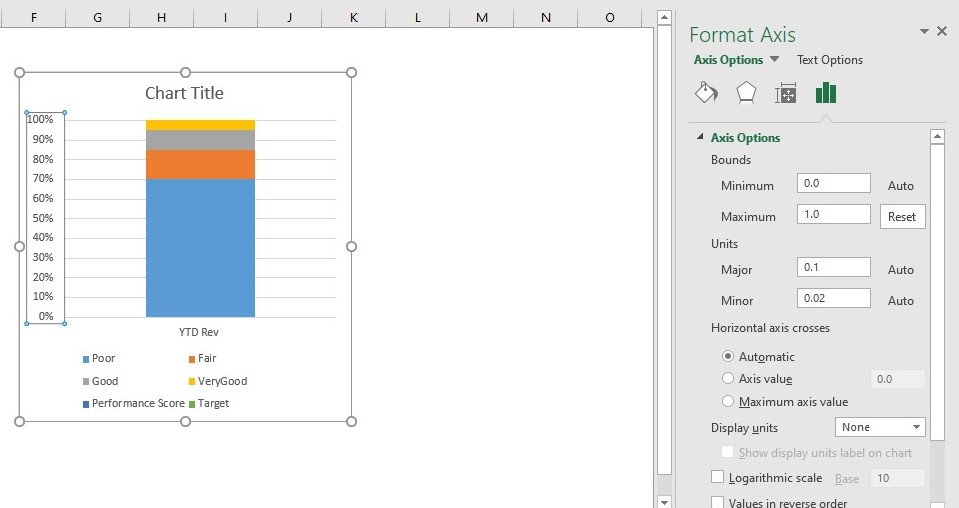
to 1.0 as shown below
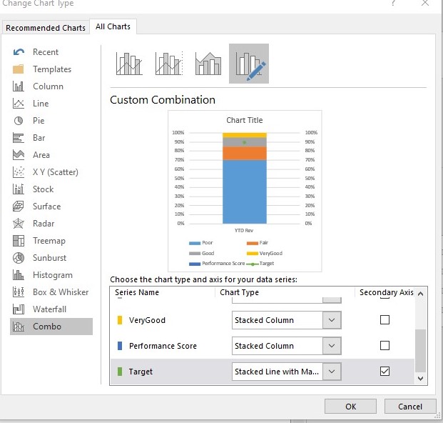
3. Right-click the stacked column chart and choose Change Series Chart Type. Use the Change Chart Type dialog box to change the Target series to a Stacked Line with Markers and check the checkbox under the secondary axis as shown below and click ok.
After clicking ok to the change, the Target series will show on the chart as a single dot as below.
4. Right-click on the chart and select Format Data Series, then from the Series Options under Format Data Series select series "Target" . Now under the Fill & Line click on the Marker option and adjust the marker to look like a line and change the size to 20.
Expand the Fill section, select solid line and change the color of the solid line to red. Expand the Border section also and set the Border to No Line.
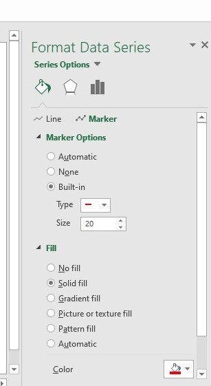
After making changes to the maker click on the Line option and expand the line section, select solid line and change the color of the solid line to red.
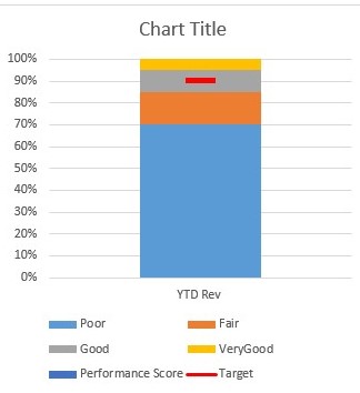
5. Right click on the new secondary axis that was added to the right side of the chart and the delete it to have a chart as below.
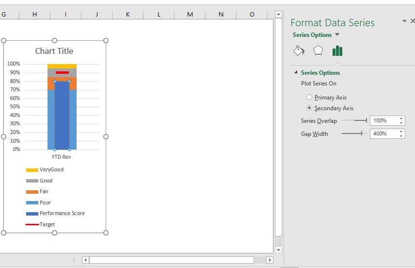
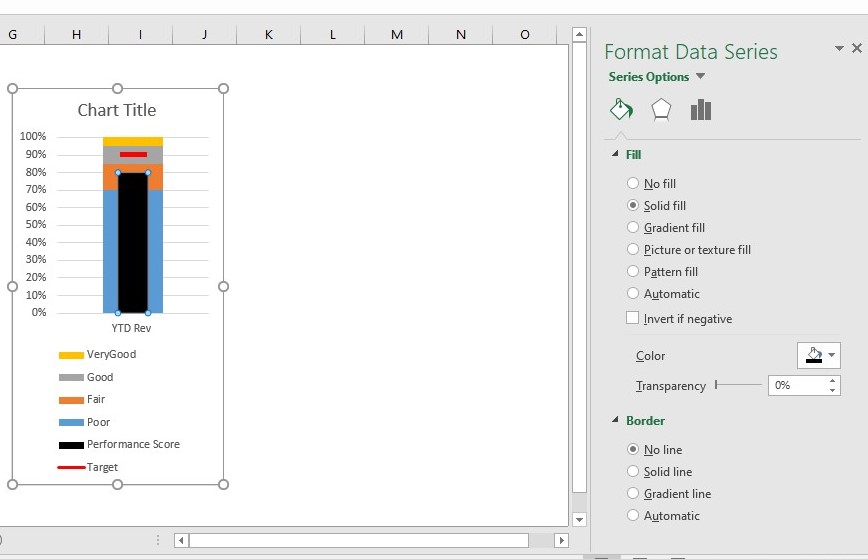
6. Now right-click on the chart and select Format Data Series, then from the Series Options under Format Data Series select series "Performance score".
7. In the Format Data Series dialog box, select Secondary Axis.
8. Still in the Format Data Series dialog box under Series Options, adjust the Gap Width property so that the Performance score series is slightly narrower than the other columns in the chart —here you are using 400% as below.
9. Still in the Format Data Series dialog box , under the Fill & Line option, expand the Fill section, and then select the Solid fill option to set the color of the Performance score series to black as shown below
10. At this point all that is left to do is to change the color for each qualitative range to incrementally lighter hues.
11. After changing the qualitative range to incrementally lighter hues let also change the title to YTD revenue Rating
The final bullet chart is given below
### Conclusion From this illustration we can see that bullet chart is an effective way of representing your progress or performance against the set target. I t is also important to know how to read bullet chart.